Table of Contents
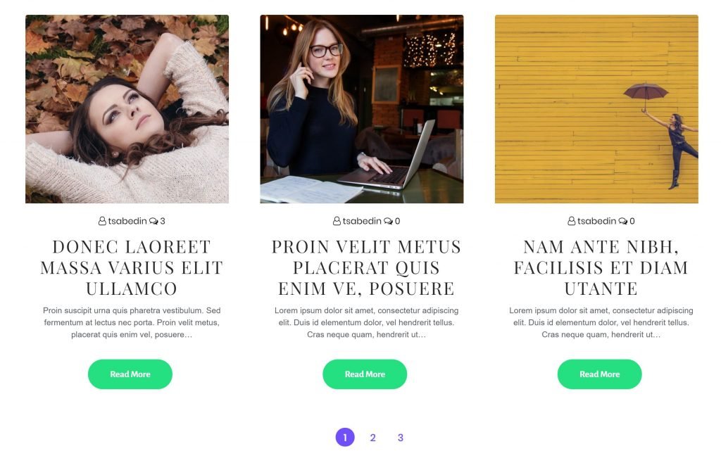
Super post module is very helpful when creating post sliders and post carousels.
Changing Posts Layout With Super Posts Module
Content #
Display Options #
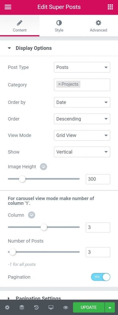
- Post Type – Here user will select the post type. It can be post, page etc…
- Category – Here user will select the category of the post. It can be single or multiple category
- Order by – Here user will select the criteria to order posts.
- Order – Here user will define the order of post – ascending / descending.
- View Mode – Here user will select view mode (Grid, carousel)
- Show – Here user will select how the post will show.
- Image Height – User will choose the image height for the post block
- Column – Here user will select number of posts to show.
- Number of Posts – User will specify the number of posts to display.
- Pagination – User can make the pagination option on / off from here.
Pagination Setting #
- Alignment – Here user will select the alignment of pagination
- Item Size – Here user will specify the size of the pagination text.
Title Options #
- Show Title – User will be able to make the post title visible / hide from here
- Tag – User will select the html tag for the title.
- Link – User will select the option to on / off the link redirect for the title text.
Meta #
- Show – User will select here if Meta information is required to display
- Display – User will select which meta information is needed to show.
Content #
- Show – User will select if the content needs to be displayed or not.
- Length (Words)– Here you will need to define the length of the content to display
- Alignment – User will select the alignment from here.
- Read More Button – User will select here if Read More button is required
- Button Text – Button text will be placed here.
- Icon – Here user will select if any icon is required with the button
- Button Position – User will select the button position from here.
- Alignment – User will select the alignment of the button.
Style #
Grid Layout Style #
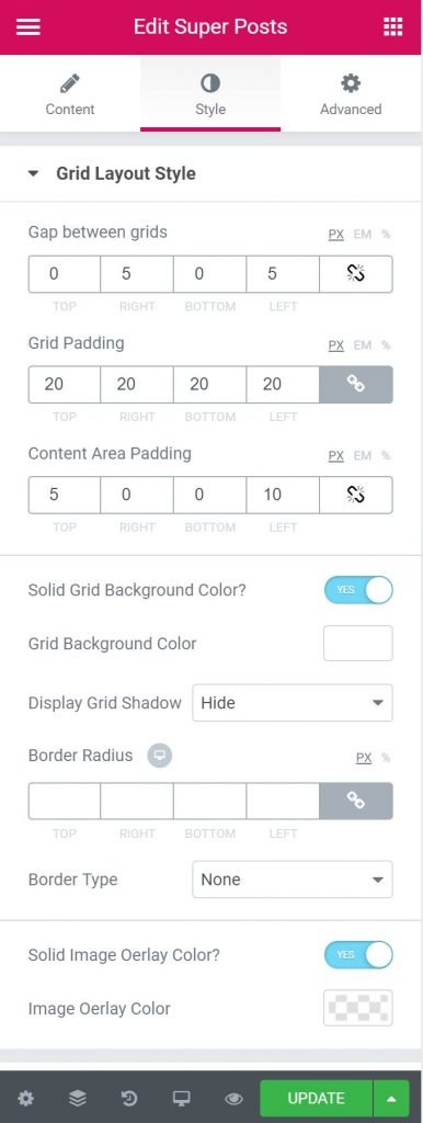
- Gap Between Grids – Here user will select the gap between grids. It’s similar to Margin
- Grid Padding – Here you can set the preferable custom padding. Fill in the values for the top, bottom, right and left padding.
- Content Area Padding – Here you can set the preferable custom padding for content area. Fill in the values for the top, bottom, right and left padding.
- Solid Grid Background Color – User will select if solid grid background color is required.
- Grid Background Color – User will choose the grid background color here.
- Display Grid Shadow – User will select if grid shadow is required.
- Border Radius – Here user will define the radius of the border. It can be pixel or %
- Border Type – Here user can select the type of border. The various option is available as like solid, dotted, dashed, groove etc..
- Solid Image Overlay Color – Here user will select if the solid image overlay color is needed.
- Image Overlay Color – Here user will select the color of image overlay.
Pagination Style
- Margin – You can input the values for the headline margins in the required fields.
- Background Color – User will choose the background color here.
- Text Color – User will choose the text color here.
- Typography – From Here user can select and define the Font family, size, weight, transform, style, decoration, line height, and letter spacing.
- Border Radius – Here user will define the radius of the border. It can be pixel or %
Title Style #
- Margin – You can input the values for the headline margins in the required fields.
- Title Color – User will choose the title color here.
- Title Hover Color – User will choose the title hover color here.
- Typography – From Here user can select and define the Font family, size, weight, transform, style, decoration, line height, and letter spacing.
Content Style #
- Margin – You can input the values for the headline margins in the required fields.
- Content Color – User will choose the content color here.
- Typography – From Here user can select and define the Font family, size, weight, transform, style, decoration, line height, and letter spacing.
Meta Style #
- Margin – You can input the values for the headline margins in the required fields.
- Meta Color – User will choose the meta color here.
- Meta Hover Color – User will choose the meta hover color here.
- Typography – From Here user can select and define the Font family, size, weight, transform, style, decoration, line height, and letter spacing.
For Date #
- Top Position – Here user will select the top position for the Date meta.
- Left Position – Here user will select the left position for the Date meta.
- Padding – Here you can set the preferable custom padding. Fill in the values for the top, bottom, right and left padding.
- Border Radius – Here user will define the radius of the border. It can be pixel or %
- Typography – From Here user can select and define the Font family, size, weight, transform, style, decoration, line height, and letter spacing.
- Date Background Color – Here user will select the background color of date.
- Date Text Color –From here user will choose the text color of date.
For Category #
- Bottom Position – Here user will choose the bottom position for the Category meta.
- Left Position – Here user will choose the left position for the Category meta.
- Padding – Here you can set the preferable custom padding. Fill in the values for the top, bottom, right and left padding.
- Border Radius – Here user will define the radius of the border. It can be pixel or %
- Typography – From Here user can select and define the Font family, size, weight, transform, style, decoration, line height, and letter spacing.
- Category Background Color – Here user will select the background color of the category.
- Category Text Color – From here user will choose the text color of the category.
Read More Button #
- Margin – You can input the values for the headline margins in the required fields.
- Padding – Here you can set the preferable custom padding. Fill in the values for the top, bottom, right and left padding.
- Typography – From Here user can select and define the Font family, size, weight, transform, style, decoration, line height, and letter spacing.
- Border Radius – Here user will define the radius of the border. It can be pixel or %
- Text Color – From here user will choose the text color of the button.
- Background Type – Here user will select the type of the background. It can be color, gradient, image
- Border Type – Here user will select the type of the border
- Box Shadow – Here user will select the box shadow if needed.


