Table of Contents
Super Accordion is a great way to display multiple text blocks in a stylish manner. It helps in three ways.
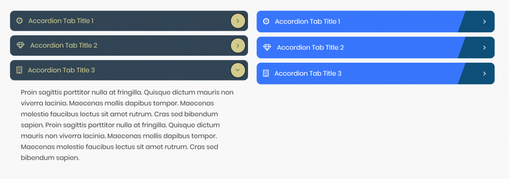
Super Accordion Module Sample #
Content #
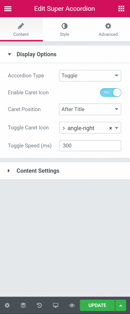
Display Options #
- Accordion Type – Here user can select the Button styles. We have premade 44 button style in the list.
- Enable Caret Icon – Here user will input the button text.
- Caret Position – User will select if the icon is needed with the button.
- Toggle Caret Icon – Here user will input the Hyperlink for the Button.
- Toggle Speed – Here user will select the alignment of the button.
Content Setting #
- The user will input all the content for accordion here (Icon, Title, text content, Animation etc..)
#
Style #
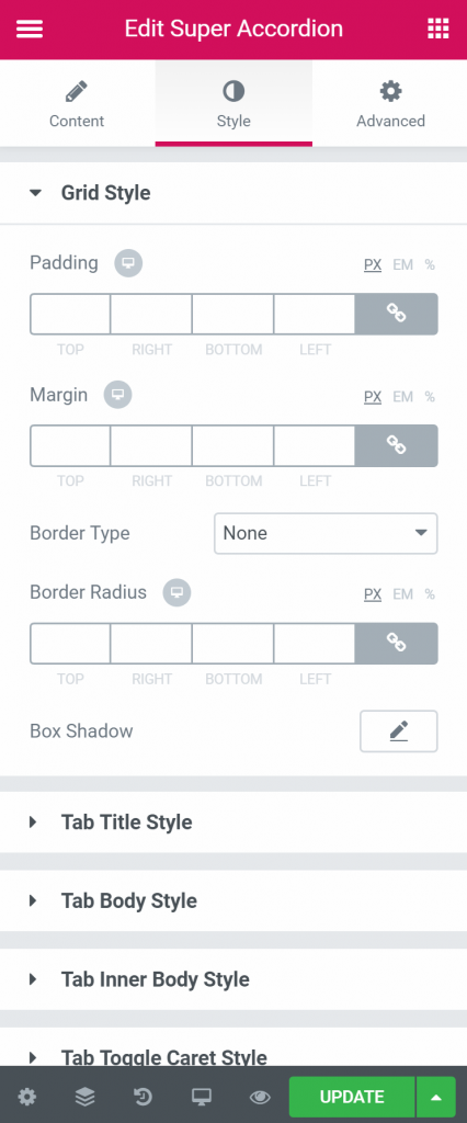
Grid Style #
- Padding – Here you can set the preferable custom padding. Fill in the values for the top, bottom, right and left padding.
- Margin – You can input the values for the margins in the required fields.
- Border Type – Here user can select the type of the border. The various option is available as like solid, dotted, dashed, groove etc..
- Border Radius – User will input border radius here. It can be in px or %.
- Box Shadow – Here you can add some shadow to the box
Tab Title Style #
- Typography – From Here user can select and define the Font family, size, weight, transform, style, decoration, line height, and letter spacing.
- Icon Size – Here user will select the icon size.
- Icon Gap – Here user will select the gap between icon and title
- Padding – Here you can set the preferable custom padding. Fill in the values for the top, bottom, right and left padding.
- Margin – You can input the values for the margins in the required fields.
- Background Type – Here user will select the type of background. It can be one color, image or gradient.
- Color – Here user will select the first color of the gradient.
- Location – Here user will select the location from where the color will start
- Second Color – Here user will select the second color.
- Location – Here user will select the location from where the second color will start
- Type – Here user will select the Gradient. It can be linear or radial
- Angle – Here user will select the angle of the gradient color.
- Text Background Type – Here user will select the text background type.
- Color – User will select the text background color here.
- Image – If a user wants to use an image as background user will be able to select it from here.
- Border Type – Here user can select the type of the border. The various option is available as like solid, dotted, dashed, groove etc..
- Border Radius – User will input border radius here. It can be in px or %.
- Box Shadow – Here you can add some shadow to the box
Tab Body Style #
- Background Type – Here user will input the Hyperlink for the Button.
- Padding – Here you can set the preferable custom padding. Fill in the values for the top, bottom, right and left padding.
- Margin – You can input the values for the margins in the required fields.
- Border Type – Here user can select the type of the border. The various option is available as like solid, dotted, dashed, groove etc..
- Border Radius – User will input border radius here. It can be in px or %.
- Box Shadow – Here you can add some shadow to the box
Tab Inner Body Style #
- Background Type – Here user will select the type of background. It can be one color, image or gradient.
- Text Color – Here user will select the text color.
- Typography – From Here user can select and define the Font family, size, weight, transform, style, decoration, line height, and letter spacing.
- Padding – Here you can set the preferable custom padding. Fill in the values for the top, bottom, right and left padding.
- Margin – You can input the values for the margins in the required fields.
- Border Type – Here user can select the type of the border. The various option is available as like solid, dotted, dashed, groove etc..
- Border Radius – User will input border radius here. It can be in px or %.
- Box Shadow – Here you can add some shadow to the box
Tab Toggle Caret Style #
- Margin – You can input the values for the margins in the required fields.
- Caren Icon Size – Here user will select the Carey Icon Size.
- Caret Area Width – Here user will select the Carey Area Width.
- Caret Area Height – Here user will select the Carey Area Height.
- Border Type – Here user can select the type of the border. The various option is available as like solid, dotted, dashed, groove etc..
- Border Radius – User will input border radius here. It can be in px or %.
- Box Shadow – Here you can add some shadow to the box
- Background Type – Here user will select the type of background. It can be one color, image or gradient.
- Color – Here you can select the toggle background Color
- Image – You can select an image s background from here.
- Icon Color – Here you will be able to define the icon color.


