Table of Contents
Through the Pricing Table module, you can showcase the prices and services your company provides in a clear way. The module has multiple options, versatile customization settings and is easy to use.
Pricing Table Module Sample #
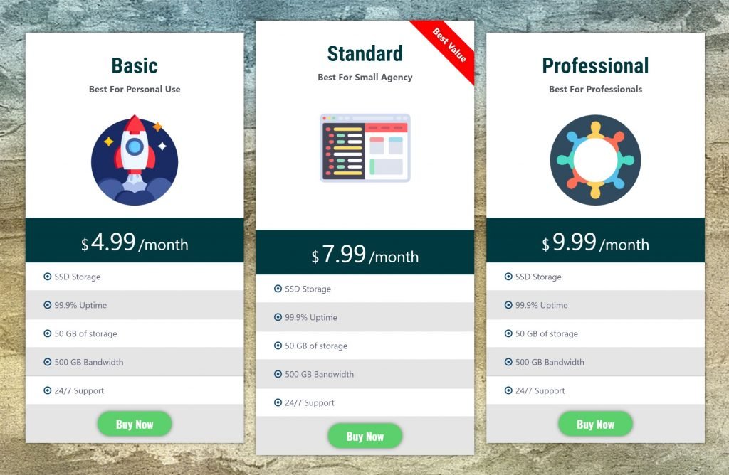
On the picture below you can view Pricing Table module sample.
Content #
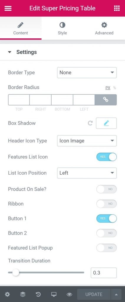
Settings #
- Border Type – Here user can select the type of border. The various option is available as like solid, dotted, dashed, groove etc..
- Border Radius – Here user will define the radius of the border. It can be pixel or %
- Box Shadow – Here you can add some shadow to the box
- Header Icon Type – Here user will select the type of the icon. It can be Icon or Image
- Features List Icon – Here user will be able to activate feature list icon if needed.
- List Icon Position – Here user will select the list icon position. It can be right o left
- Product on Sale – User will activate or deactivate if the product is now on sale
- Ribbon – User will choose if the ribbon is needed for the price box
- Button 1 – Here user will select if s/he wants to activate button 1.
- Button 2 – Here user will select if s/he wants to activate button 2.
Header #
- Image Icon – Here user will the image icon from the dropdown list of 400 icons.
- Header Icon Position – Here user will select the position of the icon
- Title – Here user will input the title
- Title HTML Tag – Here user will select the HTML tag for the title
- Subtitle – Here user will input the subtitle.
- Subtitle HTML Tag – Here user will select the subtitle HTML tag.
Price #
- Price Intro -Here user will input the price intro text
- Price – Here user will input the price
- Currency – Here user will input the currency symbol/text
- Currency Position – User will select the placement position of the currency.
- Period – Here user will input the period for the price
- On Sale Label – Here user will input the text for ON Sale Label.
Feature #
- List Item – Here user will input the list item text
- List Icon – Here user will select the list icon.
- Feature Available – Here user will select if the feature is available or not.
- Icon Color – Here user will select the icon color.
- Tooltip Text – User will input the tooltip text for the feature.
Button 1 #
- Button 1 Text – Here user will input the Text for the button
- Link – Here user will input the link URL for the button
- Icon – Here user will choose if s/he wishes to put an icon with the button
Style #
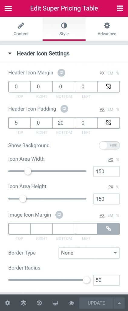
Header Icon Settings #
- Header Icon Margin – Here user will input the margin for header icon.
- Header Icon Padding – Here user will input the padding for header icon
- Show Background – Here user will show/hide the background.
- Icon Area Width – Here user will select the width of the icon area
- Icon Area Height – Here user will select the height of the icon area
- Icon Alignment – Here user will select the alignment for the icon.
- Image Icon Margin – Here user will input the margin for the icon.
- Border Type – Here user can select the type of border. The various option is available as like solid, dotted, dashed, groove etc..
- Border Radius – Here user will define the radius of the border. It can be pixel or %
Header #
- Header Margin – Here user will select header margin
- Header Padding – Here user will select header padding.
- Alignment – Here user will select the alignment for the header.
- Title Margin –Here user will select the margin for the title text.
- Background Type – User will select the background type here.
- Title Color – User will select the title text color here.
- Typography – From Here user can select and define the Font family, size, weight, transform, style, decoration, line height, and letter spacing.
- Header Gradient Text – Here user will select if header gradient text is needed.
- Subtitle Color – Here user will select the subtitle color
- Typography – From Here user can select and define the Font family, size, weight, transform, style, decoration, line height, and letter spacing.
Pricing Tag Style #
- Price Box Padding – Here user will select the price box padding.
- Background Type – User will select the background type here.
- Regular Price Margin – Here user will select the regular price margin
Currency #
- Currency Color – Here user will select the currency color.
- Typography – From Here user can select and define the Font family, size, weight, transform, style, decoration, line height, and letter spacing.
- Currency Alignment – Here user will select the currency alignment.
Price #
- Price Color – Here user will choose the color of price text.
- Typography – From Here user can select and define the Font family, size, weight, transform, style, decoration, line height, and letter spacing.
Period #
- Period Color – Here user will choose the color of period text.
- Typography – From Here user can select and define the Font family, size, weight, transform, style, decoration, line height, and letter spacing.
Features Style #
- Alternate Row Background Color – Here user will choose alternate row background color
- Row Bottom Border Color – Here user will choose row bottom border color
- Background Type – Here user will choose background type
- Features List Padding – Here user will choose feature list padding.
Feature Text #
- Text Color – Here user will select feature text color
- Strike Through Color – Here user will specify strike through color
- Text Hover Color – User will select text hover color here.
- Typography – From Here user can select and define the Font family, size, weight, transform, style, decoration, line height, and letter spacing.
Icons #
- Icon Spacing – Here user will select icon spacing.
- Icon Size – You can select icon size here.
Footer Style #
- Background Type – Here user will choose background type
- Padding – Here user will select the padding.
- Alignment – Here user will select the alignment for the feature.
Button 1 Style #
- Typography – From Here user can select and define the Font family, size, weight, transform, style, decoration, line height, and letter spacing.
- Border Radius – Here user will define the radius of the border. It can be pixel or %
- Margin – Here user will select the Margin for the button.
- Padding – Here user will select the padding for the buttons
- Text Color – Here user will select the text color for the button
- Background Type – User will select the background color for the button.
- Border Type – Here user can select the type of border. The various option is available as like solid, dotted, dashed, groove etc..
- Box Shadow – User will select the box shadow for the button.


